vef1-2025
Vefforritun 1 kennd haustið 2025
Fyrirlestur — Skalanleg vefhönnun
Vefforritun 1 — TÖL107G
Ólafur Sverrir Kjartansson, osk@hi.is
Skalanleg vefhönnun
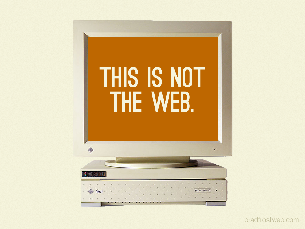
Einu sinni…
- 640 x 480
- 800 x 600
- 1024 x 768
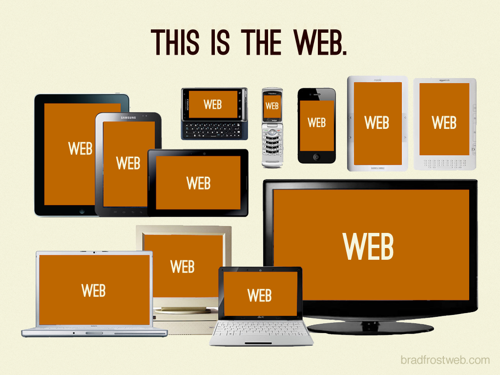
If you’ve ever used Photoshop then you’ll know what happens when you select “New” from the “File” menu: you will be asked to enter fixed dimensions for the canvas you are about to work within. Before adding a single pixel, a fundamental design decision has been made that reinforces the consensual hallucination of an inflexible web.
1680×1050
1600×900
1600×768
1600×1200
1440×900
1400×1050
1366×768
1366×720
960×540
854×480
800×480
1280×800
1280×768
1280×720
1280×1024
1200×824
1152×768
1024×768
1024×600
2048×1536
2048×1152
2048×1050
3840×2400
352×416
320x480
320×240
272×480
2560×1600
2560×1440
240×320
640×480
640×360
600×800
640x480
640×96
176×220
176×208
176×132
480×800
480×640
480×272
480×1024
720×480
720×1280
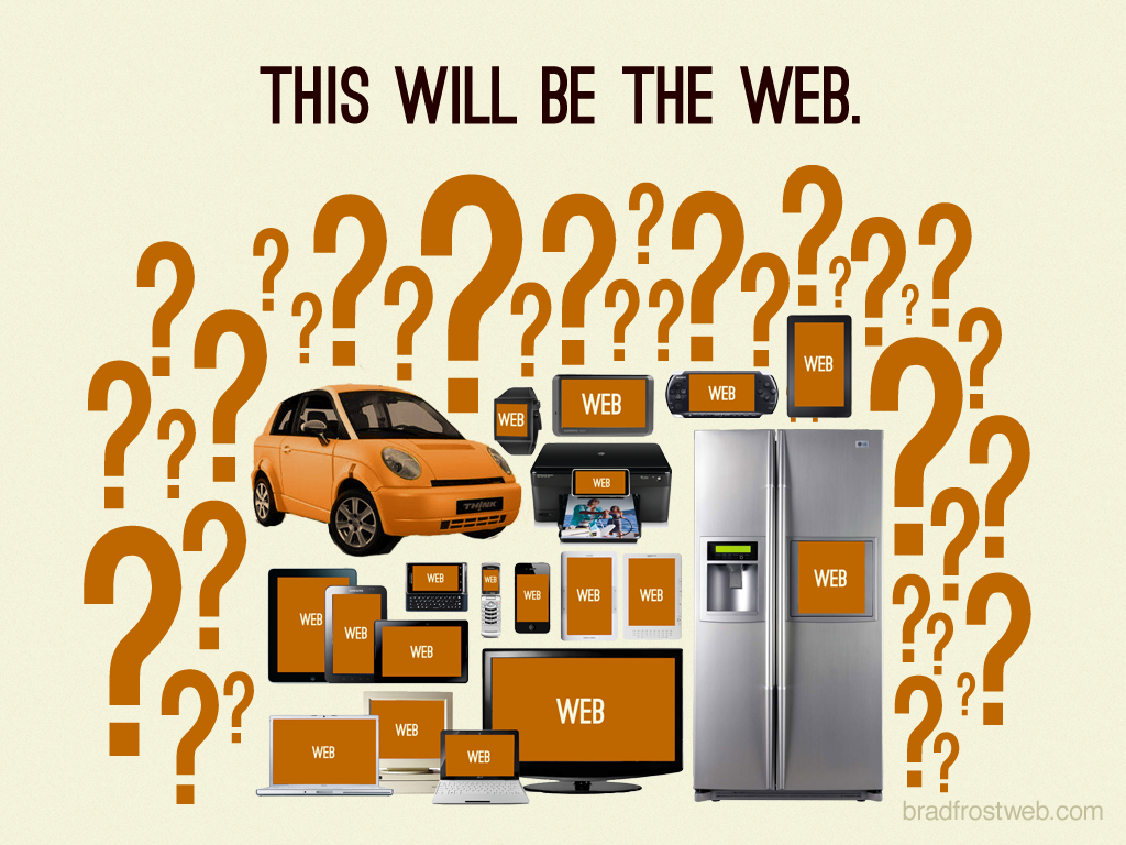
Relinquishing control does not mean relinquishing quality. Quite the opposite. In acknowledging the many unknowns involved in designing for the web, designers can craft in a resilient flexible way that is true to the medium.
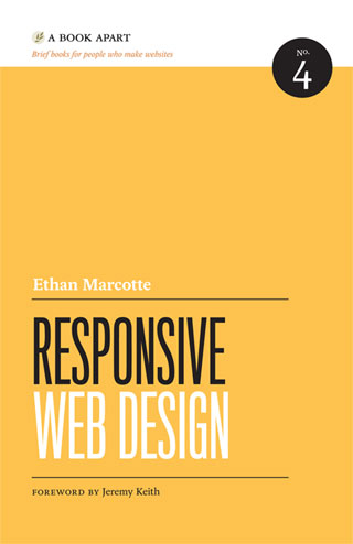
- Responsive web design
- Ethan Marcotte skrifaði grein á A List Apart 2010 sem skilgreindi skalanlega vefhönnun
- Gaf út bókina árið 2011 hjá A Book Apart
Byggir á, í mikilvægis röð:
- Sveigjanlegu umbroti, byggðu á grind
- Sveigjanlegum myndum og miðlum
- CSS media queries
- Birtum…
- sama efnið…
- með sama HTML…
- á sömu slóð..
- en! aðlögum okkur að tæki
“Responsive Web Design: Serves the same HTML code on the same URL regardless of the users’ device (for example, desktop, tablet, mobile, non-visual browser), but can render the display differently based on the screen size. Google recommends Responsive Web Design because it’s the easiest design pattern to implement and maintain.”
—Google – Mobile SEO Overview
Mobile First
- Luke Wroblewski gaf út bók hjá A Book Apart 2010 um mobile first
- Hugtak tengt skalanlegri vefhönnun
- Byrjum á að einblína á efnið og verkefnin, ekki útlitið
Mobile first
- Byrjum á upplifun í minni tækjum
- Neyðir þig til að taka ákvarðanir
- Efnið í fyrirrúmi, ekki óþarfa „skraut”
- Progressive enhancement!
“The web’s greatest strength, I believe, is often seen as a limitation, as a defect. It is the nature of the web to be flexible, and it should be our role as designers and developers to embrace this flexibility, and produce pages which, by being flexible, are accessible to all.”
—John Allsopp – A Dao of Web Design
“The primary design principle underlying the Web’s usefulness and growth is universality. […] And it should be accessible from any kind of hardware that can connect to the Internet: stationary or mobile, small screen or large.”
—Tim Berners-Lee — Long Live the Web
Tæknilegt
Byggir á:
- Sveigjanlegu umbroti, byggðu á grind
- Sveigjanlegum myndum og miðlum
- CSS media queries
Sveigjanleg grind
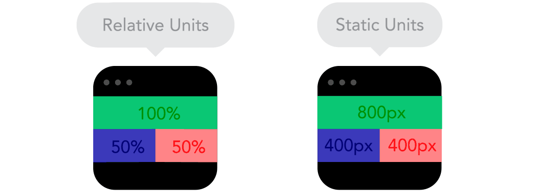
- Notum hlutfallsleg gildi, ekki nákvæm
- Ef umgjörð minnkar, þá minnkar allt hlutfallslega innan hennar
- Getum fest umgjörðina til að festa allt innihald
- Notum yfirleitt
max-widthá umgjörð til að setja hámarksbreidd
Myndir frá 9 basic principles of responsive web design
Útreikningar
- Með því að nota
target ÷ context = result
- Getum við breytt úr nákvæmu gildi í hlutfallslegt fyrir breiddir, margin, padding og letur
- Notum því prósentur
- Einnig væri hægt að nota
em
- Einnig væri hægt að nota
- T.d. erum með
1600pxumgjörð og innan hennar1200pxefnissvæði - Í staðinn fyrir
px(nákvæm stærð) notum við hlutfall í prósentum1200 ÷ 1600 = 0,75eða75%
Grind
- Skilgreinum fjölda dálka (columns) sem við vinnum með, cols
- Skilgreinum hugsanlega raðir, rows
- Gutter er plássið á milli dálka (og hugsanlega raða ef við skilgreinum)
Getum skilgreint með flexbox og margin æfingum:
- Notum neikvæð
margin-leftogmargin-rightupp á hálft gutter - Notum hálft gutter í
padding-leftogpadding-rightá hvern dálk- Dreifum gutter jafnt milli dálka
box-sizing: border-box;er lykill til að láta ganga- Getum notað
margin-leftogmargin-righttil að færa efni til í dálkum
Eða notað CSS grid! Skoðum nánar í næsta fyrirlestri.
Dæmi um flexbox grind með margins
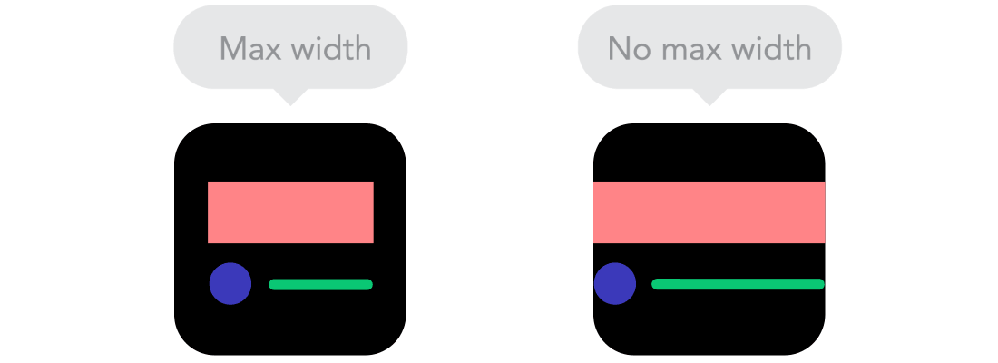
Sveigjanlegar myndir og miðlar
- Getum fest við umgjörð þeirra og látið skalast
max-width: 100%;áimgpassar að mynd fylli alltaf út í foreldi sitt
- Getum bæði minnkað/stækkað eða kroppað
object-fithjálpar til
- Dæmi
Stærðarhlutföll
- Ef við viljum viðhalda stærðarhlutföllum (aspect ratio) á efni höfum við „trikk“
- gervi-element, barn sem fyllir upp í foreldri sitt og
padding-top - Eða notað nýlegt (og ekki full stutt eigindi)
aspect-ratio
Media queries
- Ákveðum „brotpunkta“ í hönnun og breytum flæði miðað við stærð vafraglugga
- Stillum media query, t.d.
max-width– skilgreinum reglur upp að þeirri víddmin-width– skilgreinum reglur frá þeirri vídd- Hægt að
and-a saman en gerum sjaldan—reynum að halda einföldu
Media queries & progressive enhancement
- Að nýta sér mobile first hugsun þýðir að við skilgreinum í grunninn hvernig hlutur fyllir alveg út í pláss sitt
- Eftir því sem meira pláss er til staðar tekur hlutur minna pláss
- Byrjum í „mobile“
/* almennt er section 100% breitt */
section {
  width: 100%;
}

/* frá 800px breiðum viewport er
   section 50% breitt */
@media (min-width: 800px) {
  section {
    width: 50%;
  }
}
Container queries
- Container queries eru á leiðinni!
- Leið til að stjórna hegðun byggt á lausu plássi
- „Hefur þetta box a.m.k.
1000pxtil að vinna með?“ o.s.fr.
Clamp
- Þegar við útfærum skalanlega vefi viljum við stundum að gildi skalist línulega
- Ekki í discrete stökkum milli skilgreindra media queries
clamp()er fall sem við getum notað með neðri mörkum, reiknuðu gildi, og efri mörkum
font-size: clamp(1rem, 16px + 1vw, 4rem);
Getum líka gert með aðeins flóknari aðferð sem kölluð er fluid typography.
html { font-size: 16px }
@media screen and (min-width: 320px) {
  html {
    font-size: calc(16px + 6 * ((100vw - 320px) / 680));
  }
}
@media screen and (min-width: 1000px) {
  html {
    font-size: 22px;
  }
}
Picture
<picture>elementið veitir okkur frekari stjórn yfir því hvernig myndir birtast- Getum birt mismunandi stærðir, byggðar á media queries
- Gott fyrir „art direction“—sníðum myndir að skjám
<picture>
  <source
    srcset="/stor.jpg"
    media="(min-width: 800px)"
  >
  <img src="/litil.jpg" alt="">
</picture>
- Hægt er að nota
<picture>ogsrcsetattribute til að stjórna enn frekar - Í hvaða formati, í hvaða upplausn, og hversu hárri upplausn
<picture>
  <!-- ef vafri styður webp, nota  -->
  <source
    type="image/webp"
    srcset="img.webp, img-2x.webp 2x, img-3x.webp 3x">
  <!--
  fyrir skjái með 2x eða 3x device pixel
  ratio birtum við stærri myndir sem þá
  birtast „greinilegri“
  -->
  <img
    srcset="img-2x.jpg 2x, img-3x.jpg 3x"
    alt="" width="600" height="600" src="img.jpg">
</picture>
Pixel ratio
- Device pixel ratio er hlutfallið, t.d. 2x, milli
- Physical resolution — raun upplausn skjás, t.d. 960x640
- Logcial resolution — raun stærð skjás, t.d. 480x320
- Pixel density segir til um fjölda pixela per inch/cm
- Retina display er markaðshugtak frá Apple þar sem pixel density er um 300 ppi og við horfum á skjáinn í um 25 cm fjarlægð — augað greinir ekki pixela
<meta name="viewport">
Getum leiðbeint vafra hvernig síða birtist:
widthsetur breidd viewports:tala– föst breidddevice-width— viewport er jafnt logical resolution ekki physical resolution
initial-scale, upphafs zoom á síðu
minimum-scale, hversu lítil síða má verða — hve langt má zooma útmaximum-scale, hversu stór síða má verða — hve langt má zooma innuser-scalable, má zooma? viljum ekki banna
<meta
 name="viewport"
 content="width=device-width,initial-scale=1"
>
Ef við skilgreinum ekki width=device-width í <meta name="viewport"> og notum media queries mun vefurinn okkar ekki birtast eins og við höldum í tækjum með hærri raunupplausn.
Allir saman nú!
- Erum með síðu sem bregst við umhverfi sínu
- Einföld hugmynd en getur orðið mjög flókið
- Prófanir á mörgum tækjum erfiðar